How to Center Anything in CSS (Text, Images, Divs & More)
Introduction
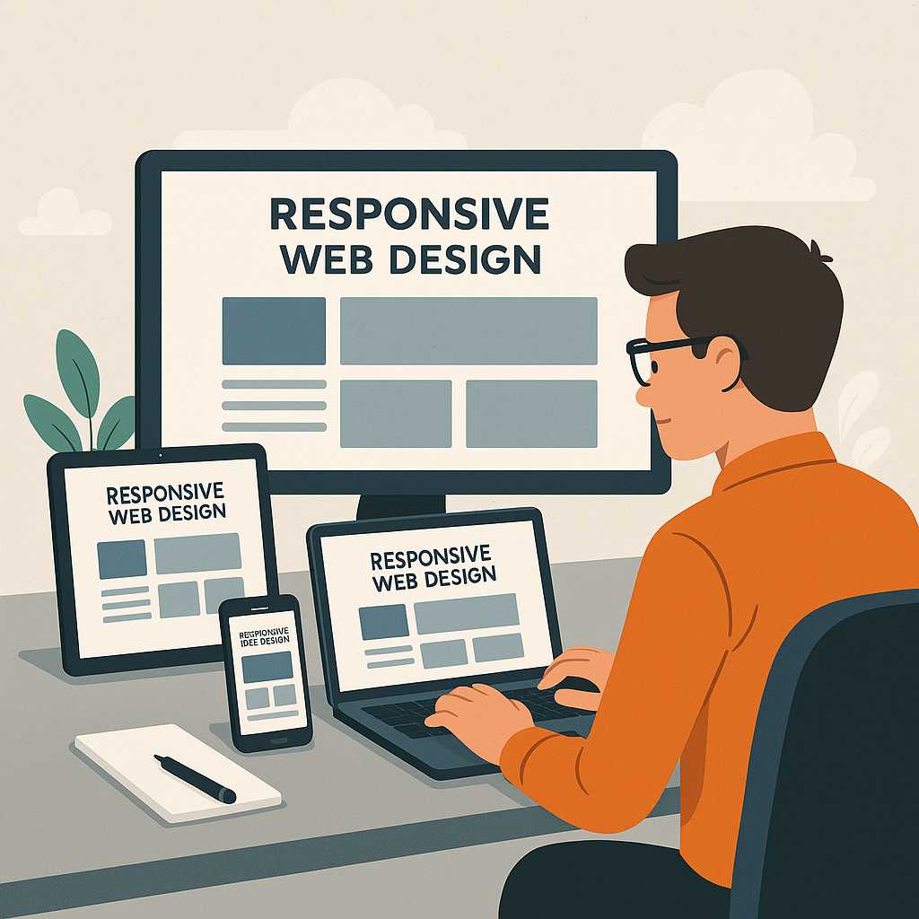
Centering elements in CSS is one of the most common yet surprisingly tricky tasks for web developers. Whether you’re working on aligning a text block, centering an image, or vertically aligning a container, CSS offers multiple techniques — each suited for different use cases. In this guide, we’ll explore how to center anything in CSS using both modern and traditional methods, along with practical code examples and explanations.
By the end of this two-part guide, you’ll know exactly how to handle every centering challenge — horizontally, vertically, and both together — using approaches like Flexbox, Grid, and classic positioning techniques.
Why Centering in CSS Can Be Confusing
At first glance, centering something sounds simple. But the confusion arises because CSS doesn’t have a single universal “center” property. Depending on the element type, its display behavior (block, inline, flex, or grid), and its parent container, the centering method changes. For example:
- Centering text is not the same as centering a div.
- Centering inline elements differs from block elements.
- Centering with Flexbox is modern and efficient, but margin: auto still has its uses.
So, instead of memorizing rules, it’s better to understand why each method works — and when to use it. Let’s go step by step.
1. How to Center Text in CSS
The simplest case is centering text horizontally. For this, you can use the text-align property on the parent container.
p {
  text-align: center;
}
This centers the inline content (like text or inline elements) inside a block-level container. However, it doesn’t affect vertical alignment.
Vertically Center Text Inside a Container
To center text vertically, you can use Flexbox:
.box {
  display: flex;
  justify-content: center; /* horizontally */
  align-items: center;     /* vertically */
  height: 200px;
  border: 1px solid #ccc;
}
This method centers text or inline elements both horizontally and vertically. You can also use this technique to center icons or buttons inside containers.
2. How to Center a Div Horizontally
To center a block-level element (like a <div>) horizontally, the classic method is using margin: auto. This works when the element has a defined width.
.container {
  width: 300px;
  margin: 0 auto;
  background-color: #f2f2f2;
}
Here, margin: 0 auto means zero margin on the top and bottom, and automatic equal margins on the sides. This is still one of the most reliable methods for centering fixed-width elements horizontally.
3. Centering a Div Vertically (Old-School Way)
Vertical centering used to be the toughest part of CSS before Flexbox and Grid. The old-school trick involves using position and transform:
.center-div {
  position: absolute;
  top: 50%;
  left: 50%;
  transform: translate(-50%, -50%);
}
This moves the element to the exact center of its parent container. It works well for fixed or absolutely positioned layouts but can become complex in responsive designs.
4. Centering Anything with Flexbox
CSS Flexbox is the most popular and modern way to center anything in CSS. It’s flexible, easy, and supports both directions at once.
.parent {
  display: flex;
  justify-content: center; /* horizontal centering */
  align-items: center;     /* vertical centering */
  height: 100vh;
}
This method is ideal for responsive layouts. Whether it’s a div, image, text, or button — Flexbox handles it effortlessly.
Example:
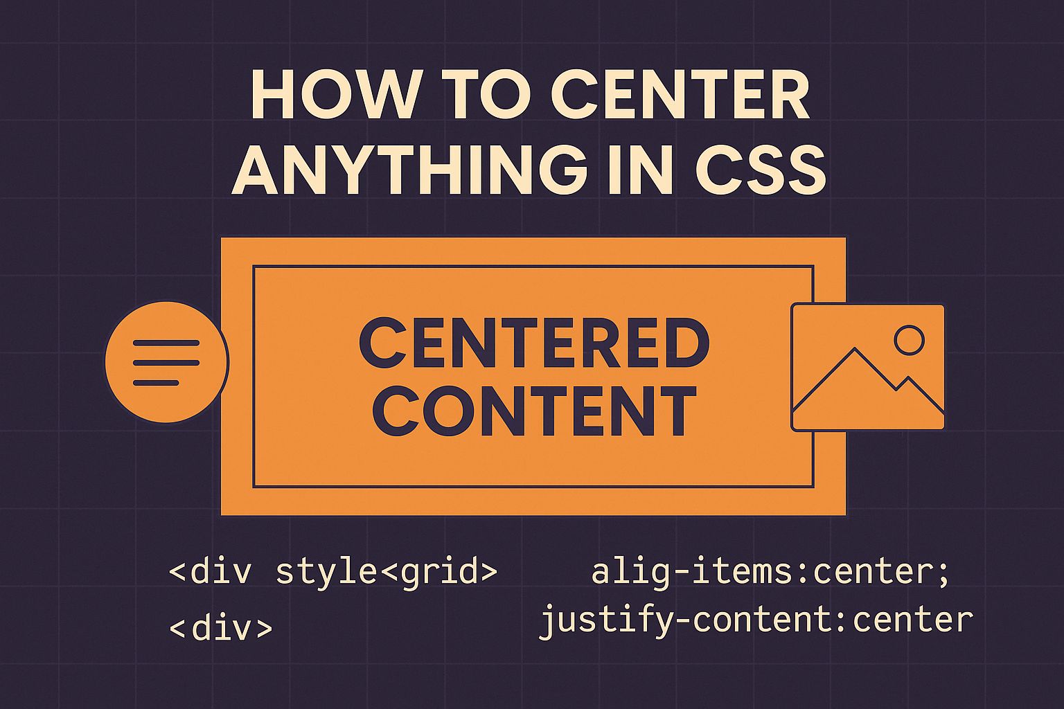
<div class="parent">
  <div class="child">Centered Content</div>
</div>
When to Use Flexbox
- When you need to center multiple elements easily
- When working with responsive layouts
- When you want cross-browser reliability
Flexbox is more efficient than older centering techniques, and it’s now supported in all major browsers. If you’re still using outdated methods, it’s a good time to upgrade.
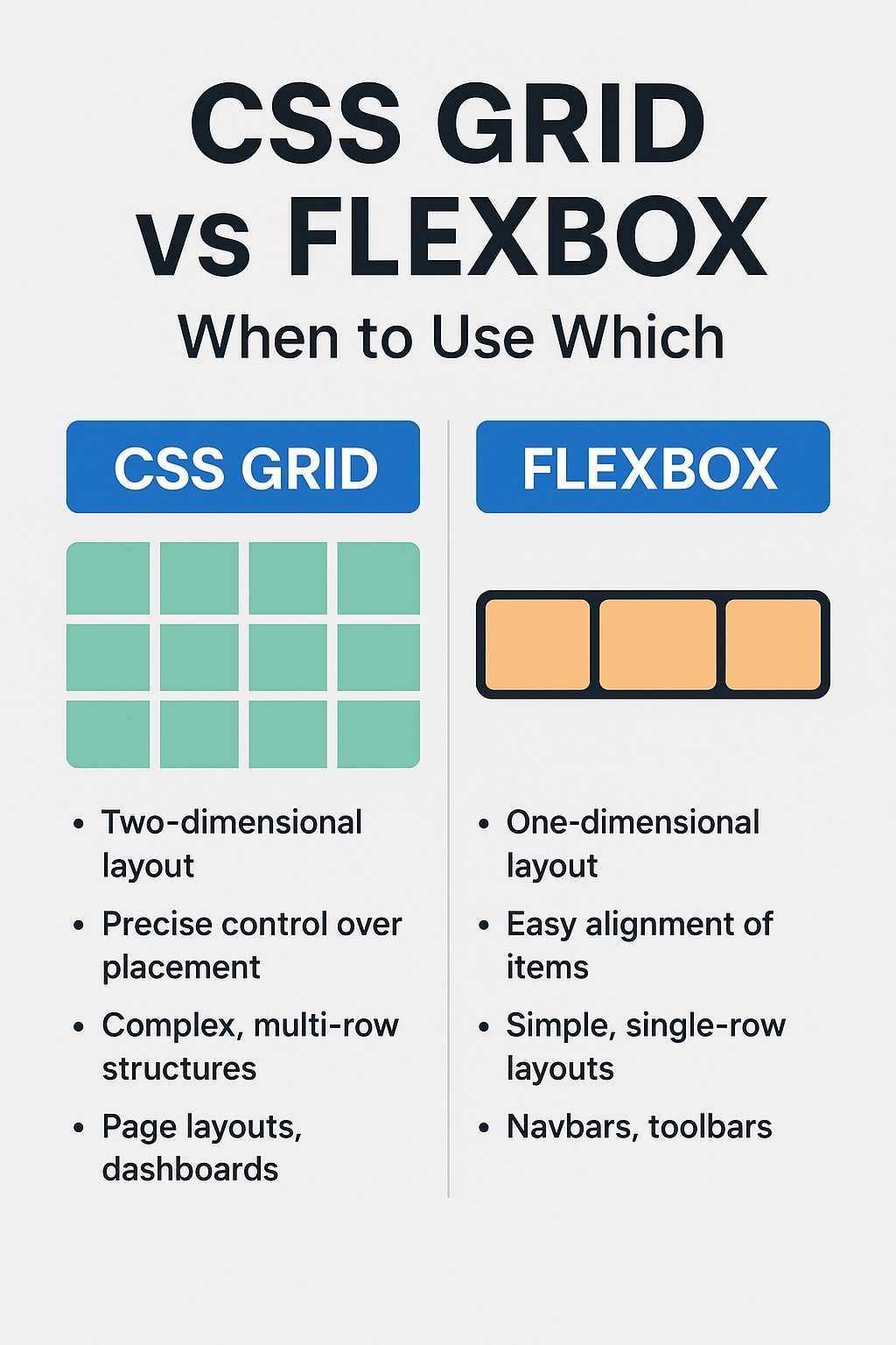
5. How to Center Elements Using CSS Grid
CSS Grid offers another elegant way to center elements both horizontally and vertically with a single line of code. It’s perfect for layout-level centering.
.grid-center {
  display: grid;
  place-items: center;
  height: 100vh;
}
The place-items: center; shorthand automatically sets both justify-items and align-items to center. This makes Grid a great choice when you’re building complex layouts or full-page structures.
6. Centering an Image in CSS
Centering images is another common challenge. You can use display: block and margin: auto for horizontal centering.
img {
  display: block;
  margin: 0 auto;
}
If you want to center an image both horizontally and vertically inside a container, Flexbox again is your best friend:
.img-container {
  display: flex;
  justify-content: center;
  align-items: center;
  height: 300px;
}
This ensures your image stays perfectly centered regardless of screen size or resolution.
7. Centering Inline Elements
For inline or inline-block elements like <span> or <button>, simply use text-align: center; on the parent container. This works great for navigation links, badges, or inline icons.
.button-group {
  text-align: center;
}
Then just wrap your inline buttons or icons inside this parent div to achieve a balanced layout.
8. Common Mistakes Developers Make
- Using
text-align: centeron block-level elements expecting vertical centering. - Not defining a height or width when needed.
- Forgetting to set
display: flexordisplay: gridbefore using their properties. - Mixing different centering techniques in one container.
Understanding how CSS handles the box model and display types helps avoid these pitfalls. Once you master Flexbox and Grid, centering becomes second nature.
Next Steps
In Part 2 of this guide, we’ll cover more advanced centering examples, responsive techniques, and how to center absolutely everything — from modals to entire web layouts. We’ll also include FAQs, Further Reading, and a detailed Conclusion to wrap it all up.
Before moving on, you may also like reading: Top 10 Web Development Trends 2025 and HTML5 vs HTML4 Difference.
9. Advanced Centering Techniques in CSS
Once you’re comfortable with the basics of Flexbox and Grid, you can take centering to the next level. Developers often face cases where elements must remain centered dynamically — such as modals, pop-ups, loaders, or full-page overlays. Let’s explore some of these advanced cases.
Centering a Modal or Popup
Modals need to appear perfectly centered regardless of screen size or orientation. The best approach is to combine position and transform with Flexbox for cross-browser stability.
.modal-container {
  position: fixed;
  top: 0;
  left: 0;
  width: 100%;
  height: 100%;
  display: flex;
  justify-content: center;
  align-items: center;
  background: rgba(0,0,0,0.5);
}

.modal {
  background: #fff;
  padding: 2rem;
  border-radius: 8px;
}
This creates a flexible modal container that perfectly centers its content both horizontally and vertically. The transparent overlay ensures a professional look and a smooth user experience.
Centering a Loader or Spinner
When building loading screens, it’s essential to keep the spinner centered as the viewport changes. Flexbox makes this trivial:
.loader-container {
  display: flex;
  justify-content: center;
  align-items: center;
  height: 100vh;
}
Whether the spinner is a GIF, SVG, or CSS animation, this setup guarantees it stays in the middle of the page, even when resized.
10. Responsive Centering for Mobile and Tablets
Responsiveness plays a vital role in modern web design. You want your content centered not just visually, but also functionally across devices. CSS offers various approaches depending on your layout needs.
Using Media Queries
You can fine-tune centering behavior for smaller screens using media queries:
@media (max-width: 768px) {
  .hero-section {
    display: flex;
    flex-direction: column;
    justify-content: center;
    align-items: center;
    text-align: center;
  }
}
This ensures your hero images, headings, and call-to-action buttons remain centered on tablets and mobile devices.
Using CSS Grid for Responsive Alignment
For layout grids, place-items: center; adapts naturally to any viewport. It’s especially useful when combined with fractional units (fr) and minmax() for flexible columns.
.grid-layout {
  display: grid;
  grid-template-columns: repeat(auto-fit, minmax(300px, 1fr));
  place-items: center;
  gap: 1rem;
}
This layout automatically adjusts and keeps items centered — perfect for cards, galleries, or product listings.
11. Centering with Modern CSS Properties
Newer CSS properties and techniques have made centering even simpler and more powerful.
Using the inset Property
The inset shorthand (introduced in CSS Logical Properties) can replace top, right, bottom, and left simultaneously.
.center-box {
  position: absolute;
  inset: 0;
  margin: auto;
  width: 200px;
  height: 100px;
  background-color: #e0e0e0;
}
With margin: auto, the element is centered both horizontally and vertically within its parent container — a clean modern approach.
Using aspect-ratio and Centering Together
The aspect-ratio property ensures visual balance while centering elements like images or video frames.
.video-frame {
  display: flex;
  justify-content: center;
  align-items: center;
  aspect-ratio: 16 / 9;
  background-color: #000;
}
This ensures your video container stays proportionally centered at all times, regardless of the screen size.
12. Real-World Use Cases
Let’s apply what we’ve learned with practical web development scenarios:
- Centering a Call-to-Action Button: Use
text-align: centerinside the parent section. - Centering Login Forms: Use Flexbox for easy alignment both horizontally and vertically.
- Centering a Hero Banner: Use Grid with
place-items: centerfor a clean, responsive look. - Centering SVG Icons: Use Flexbox or
vertical-align: middlefor inline SVGs.
As a developer, you’ll find that a combination of Flexbox and Grid covers nearly all centering challenges in modern web design. For a complete understanding of Flexbox, check out CSS Flexbox Complete Guide with Examples.
Further Reading
- Top 10 Web Development Trends 2025
- HTML5 vs HTML4 Difference
- CSS Flexbox Complete Guide with Examples
FAQs
1. How do I center a div both horizontally and vertically?
The easiest way is to use Flexbox:
.parent {
  display: flex;
  justify-content: center;
  align-items: center;
}
This method works for any element, regardless of size.
2. How do I center text inside a div?
Use text-align: center for horizontal centering. For vertical alignment, combine it with Flexbox using align-items: center.
3. Can I center elements without using Flexbox?
Yes. You can use CSS Grid’s place-items: center or classic positioning with transform: translate(-50%, -50%).
4. Why isn’t my centering working in CSS?
Check the element’s display type. For example, margin: auto won’t work unless the element has a defined width and is block-level.
5. What’s the best method to center elements in modern CSS?
Flexbox and Grid are the most efficient and responsive centering methods. Flexbox is ideal for aligning components, while Grid excels in full-page layouts.
Conclusion
Centering elements in CSS has evolved from frustrating trial-and-error into a simple, flexible process. With modern tools like Flexbox and Grid, you can now center text, images, divs, or entire sections using just a few lines of CSS. The key is understanding when to use each method — from margin: auto for fixed layouts to place-items: center for full-page alignment.
Whether you’re a beginner experimenting with layout basics or a professional polishing a responsive web design, mastering centering is a must-have skill in your CSS toolkit. Now you can confidently say you know how to center anything in CSS!